Teaching
Most students walk into the classroom unsure what to expect, or why it should matter. I teach for the moment that changes when something stops being an assignment and starts being theirs.
Philosophy
I think of teaching as demystification—showing someone that a poster, a building, a piece of furniture was made with certain intentions, and those intentions can be studied, questioned, and understood. This habit matters more than any single grade or final project. I care less about specific outcomes or memorization than whether someone actually wrestled with the material. It’s the same thing I chase with woodworking, where the finished piece matters less than the hours spent making it. What I want people to leave with isn’t facts, but a habit of asking better questions—of a poster, a chair, or themselves.
Teaching By Hand
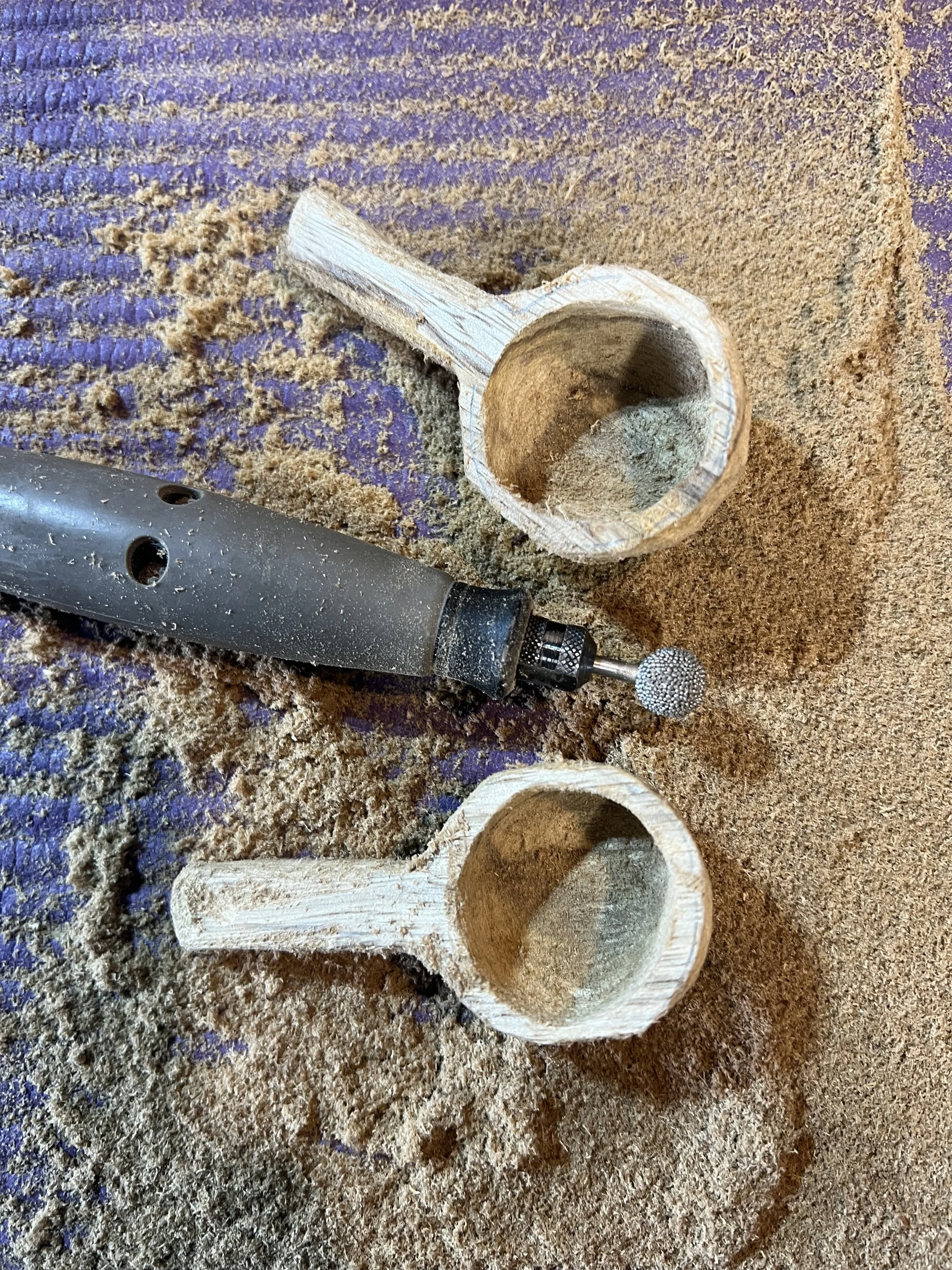
Graphic design and its history are what I have the most experience teaching, but I’m not stopping there. I’m increasingly drawn to teaching in a shop versus a classroom—hands-on wood instead of a page, the same demystification happening through a different material. Building out hands-on workshops, where people leave having actually made something rather than just watched, is one of the things I’m most excited to pursue next.
“It is not from ourselves that we learn to be better than we are.”
wendell berryGraphic Design History
I was lucky enough to study under Philip Meggs—the person who literally wrote the history of graphic design, the book that’s still the field’s standard text decades later. Being taught by the person who invented the subject as an academic discipline shaped how I think about it: not trivia to memorize, but a living argument about how images and artifacts have always moved people. A poster isn’t merely a composition exercise; it’s a government trying to convince a population to ration food, or an avant-garde movement trying to shock a culture out of complacency after a war. Propaganda is one of the oldest and most effective uses of graphic design there is, and I don’t shy away from teaching it as exactly that: a case study in how design manufactures belief, for better and worse.
Case StudyWPA Posters
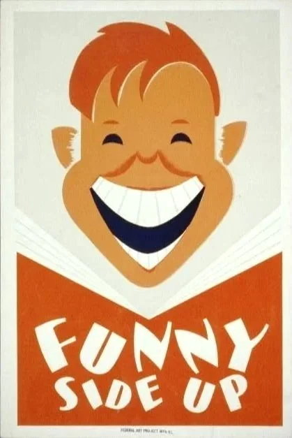
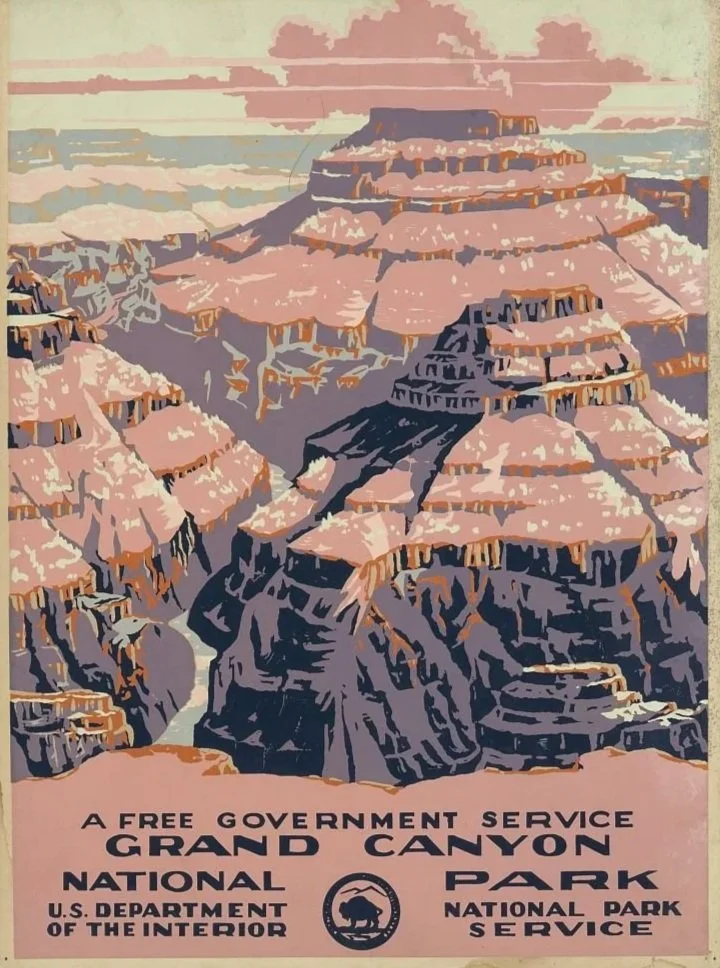
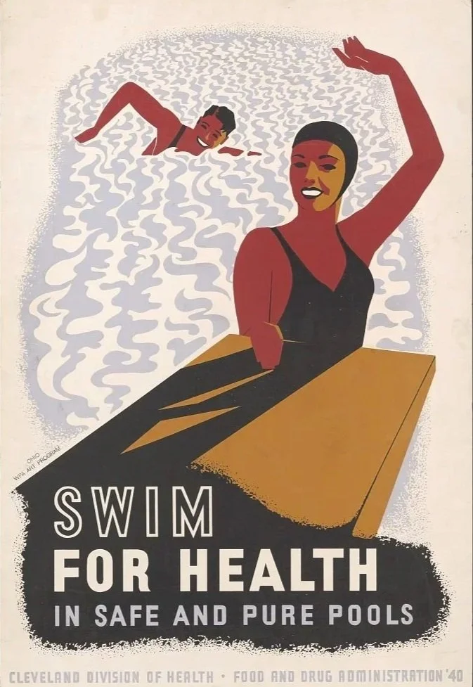
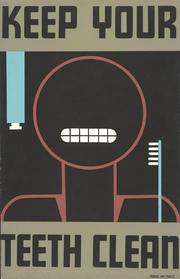
During the Great Depression, the federal Works Progress Administration put unemployed artists to work too—producing roughly 35,000 poster designs between 1935 and the early ’40s, promoting public health, safety, and community programs on the government’s dime. Every choice in these posters—bold color, blunt shapes, a message readable from across a room—was made with one intention: reach as many people as possible, as fast as possible, at a moment when the country needed exactly that. The content can look almost naively simple now (yes, machinery is dangerous), but that simplicity was deliberate—it’s propaganda in the most literal, least cynical sense, art in service of survival by artists who needed the work as much as the country needed the message.
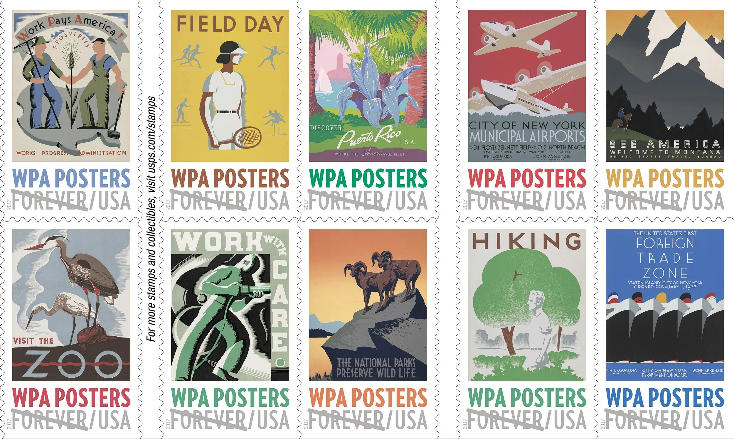
The USPS released a commemorative booklet of WPA Forever Stamps in 2017.
Case StudyThe Assignment
Each student in my Graphic Design History course keeps a notebook—part research journal, part scrapbook—filled in weekly with a new prompt: something to research, dig into, question the intention behind. I assign this instead of an essay or exam because understanding why a design decision was made isn't something you absorb by memorizing facts—it’s something you have to work through, page by page, in your own hand.
Case StudySelect Artifacts
Design history is filled with countless artifacts and ephemera. These objects are intrinsically linked to what was happening in the world around them and help us understand our own global history. Here are just a few of my favorites.
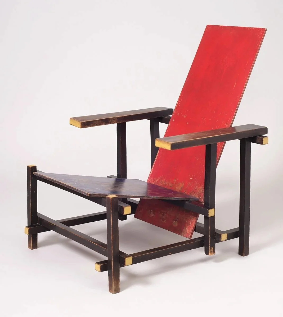
Designed for “alert, contemplative activity,” Gerrit Rietveld’s Red/Blue Chair uses primary colors and flat planes in the spirit of Dutch De Stijl. Rietveld wanted it mass-producible, so he built it entirely from standard lumber sizes already available at the time.
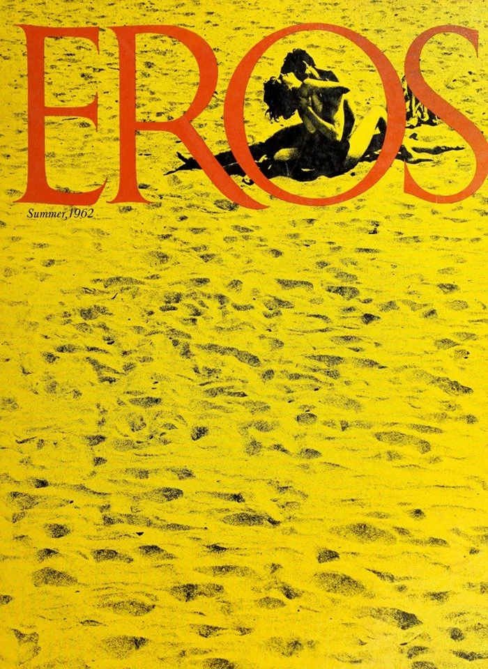
Eros was an American magazine published in 1962—genuinely well-designed, genuinely intelligent about a subject most publications treated cheaply. Founded by Ralph Ginzburg and designed by Herb Lubalin, it ran four issues before conservative backlash turned into federal obscenity charges, eventually landing Ginzburg in prison.
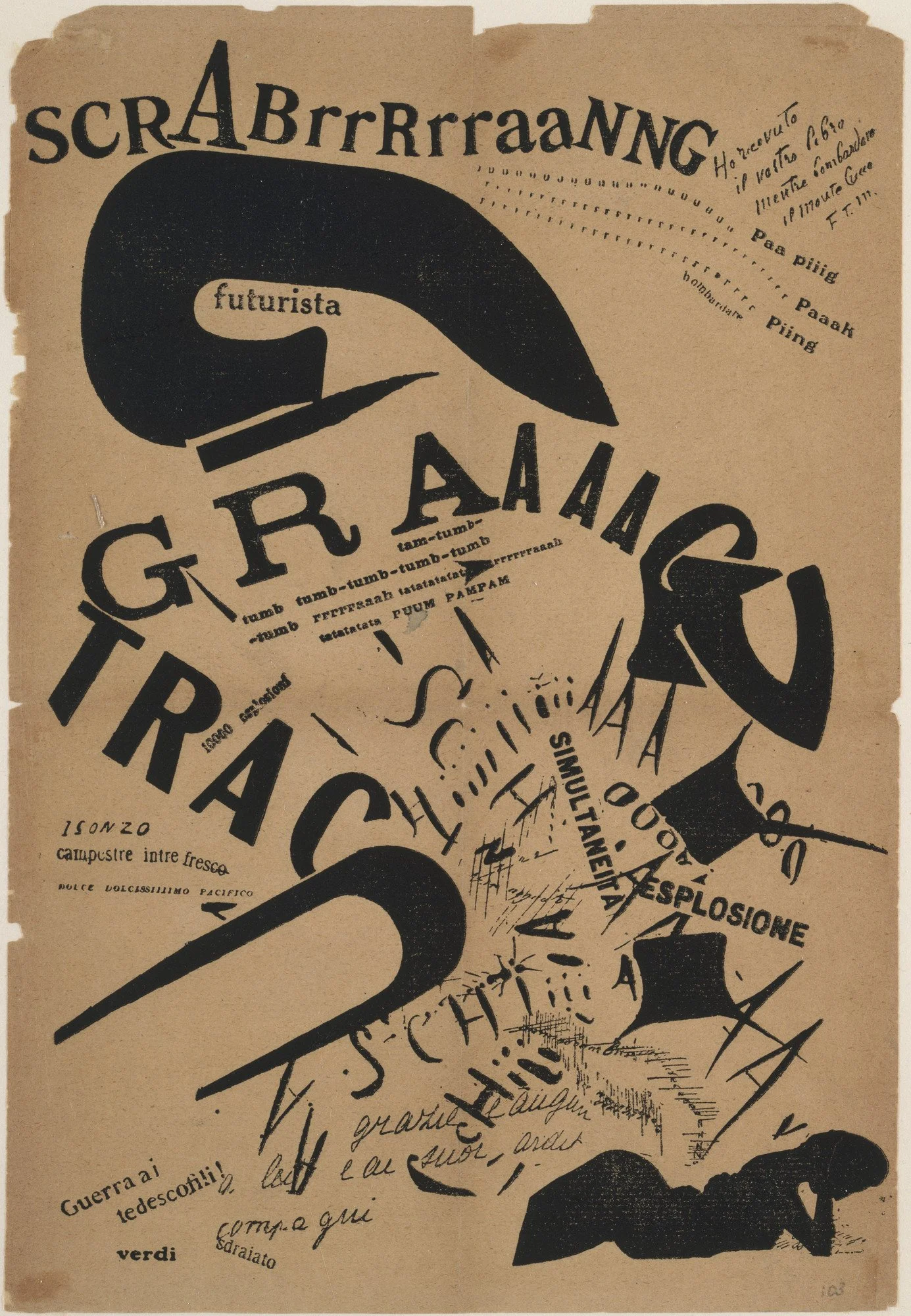
In 1917, Futurist poet Filippo Marinetti pointed his movement’s obsession with speed and chaos at typography. The poem itself is a woman at home, surrounded by the distant sounds of war, rereading a letter from her soldier lover—and Marinetti scattered words, fragments, and distorted letters across the page to recreate that same sensory chaos, what he called “words-in-freedom.” The typography isn’t just experimental for its own sake; it’s the noise of war made visible on the page, with her one fixed point—the letter—the only thing still legible in the wreckage.
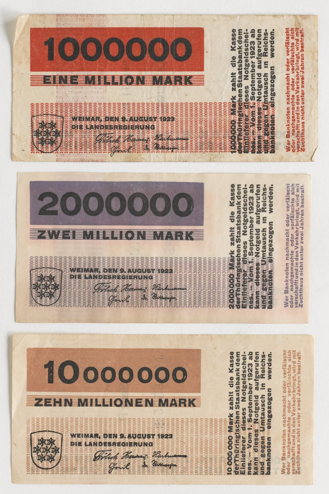
In 1923, German hyperinflation was destroying the value of money by the day. The Weimar state of Thuringia needed new, higher-denomination notes fast, and the job fell to Herbert Bayer, a 23-year-old Bauhaus student with roughly two days to design them. The result was pure Bauhaus—geometric, sans-serif, built from grids and color instead of ornate crests—modernism landing in people’s pockets almost by accident.
If you’re building a course, a workshop, or just want to talk about how design history gets taught, I’d love to hear from you!